Web.

A website built to sell. The ad and the page say the same sentence.

The idea

A page is a salesperson, not a brochure.

The ad makes a promise. The page has to pick up exactly that sentence, or the click was wasted. So every page we build continues an ad: the same words, the same person, the same offer.

Before the first block, we write down the reasons your customer won’t believe you, taken from competitor reviews, threads about products that let them down, and replies from abandoned carts. Every block on the page answers one of them.

We never tell the customer they are wrong. The page agrees with them first, shows where their current solution stops, adds what they didn’t know yet, and only then shows the product.

The build

Five screens, five jobs.

01

Landing page

For cold traffic from ads. It picks up exactly where the ad stopped: the same sentence, the problem in their words, why nothing has worked so far, proof, then the offer.

02

Product

Every block answers one belief. Promise, photo and price up top with the rating under the name, quantities that lift the cart, reviews with photos, guarantee and FAQ, and an add to cart button that stays on screen.

03

Cart

Where order value goes up. A bar showing how far to free shipping, a gift they can see before they reach the threshold, a one click add-on, and no surprises in the price.

04

Checkout

No extra fields. Email first, so the follow-up can run, address autocomplete, shipping price and date together, and quick payment options.

05

Thank you

The cheapest sale in the whole shop. What arrives and when, how to get started, an offer on the next order, and the ask for a review.

So far

58%

Average revenue growth.

What we have built

Live stores, built by us.

Open either one to see what we did and why.

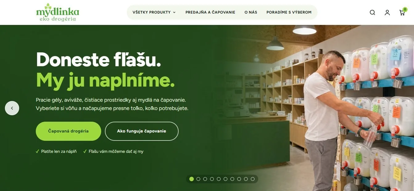
Neurocanna, a screenshot of the site Neurocanna Kanabidiol brand, Slovakia. The whole store rebuilt, a sales page for trade buyers, a quiz that routes shoppers to the right product. WebsiteB2B pageQuizTracking See more Mydlinka, a screenshot of the site Mydlinka A refill drugstore in Bratislava. A new store around the thing nobody else in the market has: bring a bottle, and they fill it. WebsiteWooCommerceTracking See more
The website frame of our funnel board: landing page, product, cart, checkout and thank-you page
See the whole funnel

The floor

Without this, ads make no sense.

85 to 90% Visits from clicks

Of everyone who clicks an ad, this many should actually land on the page. Less means a slow site or bad placements, and every lost click is paid for.

14 days From start to live

Then 100% yours on handover: your domain, your hosting, your content, and you can edit it yourself.

01

Mobile first

Most visits come from a phone, inside the Instagram or Facebook app. We design for that screen first.

02

The same sentence everywhere

The ad’s promise is the page’s first line, the email’s subject and the offer’s name.

03

Every page has a layer

A page for cold traffic assumes no interest. A product page for buyers doesn’t explain it all again.

04

Measured from day one

Product view, cart, checkout, purchase and email signup are tracked from the moment it goes live.

Your store next.

Tell us your stage. We’ll tell you the move.